Customizing bottom tab bar
This guide covers customizing the tab bar in createBottomTabNavigator. Make sure to install and configure the library according to the installation instructions first.
Add icons for each tab
This is similar to how you would customize a stack navigator — there are some properties that are set when you initialize the tab navigator and others that can be customized per-screen in options.
- Static
- Dynamic
// You can import Ionicons from @expo/vector-icons/Ionicons if you use Expo or
// react-native-vector-icons/Ionicons otherwise.
import Ionicons from 'react-native-vector-icons/Ionicons';

const RootTabs = createBottomTabNavigator({
  screenOptions: ({ route }) => ({
    tabBarIcon: ({ focused, color, size }) => {
      let iconName;

      if (route.name === 'Home') {
        iconName = focused
          ? 'ios-information-circle'
          : 'ios-information-circle-outline';
      } else if (route.name === 'Settings') {
        iconName = focused ? 'ios-list' : 'ios-list-outline';
      }

      // You can return any component that you like here!
      return <Ionicons name={iconName} size={size} color={color} />;
    },
    tabBarActiveTintColor: 'tomato',
    tabBarInactiveTintColor: 'gray',
  }),
  screens: {
    Home: HomeScreen,
    Settings: SettingsScreen,
  },
});
// You can import Ionicons from @expo/vector-icons/Ionicons if you use Expo or
// react-native-vector-icons/Ionicons otherwise.
import Ionicons from 'react-native-vector-icons/Ionicons';

function RootTabs() {
  return (
    <Tab.Navigator
      screenOptions={({ route }) => ({
        tabBarIcon: ({ focused, color, size }) => {
          let iconName;

          if (route.name === 'Home') {
            iconName = focused
              ? 'ios-information-circle'
              : 'ios-information-circle-outline';
          } else if (route.name === 'Settings') {
            iconName = focused ? 'ios-list' : 'ios-list-outline';
          }

          // You can return any component that you like here!
          return <Ionicons name={iconName} size={size} color={color} />;
        },
        tabBarActiveTintColor: 'tomato',
        tabBarInactiveTintColor: 'gray',
      })}
    >
      <Tab.Screen name="Home" component={HomeScreen} />
      <Tab.Screen name="Settings" component={SettingsScreen} />
    </Tab.Navigator>
  );
}
Let's dissect this:
tabBarIconis a supported option in bottom tab navigator. So we know we can use it on our screen components in theoptionsprop, but in this case chose to put it in thescreenOptionsprop ofTab.Navigatorin order to centralize the icon configuration for convenience.tabBarIconis a function that is given thefocusedstate,color, andsizeparams. If you take a peek further down in the configuration you will seetabBarActiveTintColorandtabBarInactiveTintColor. These default to the iOS platform defaults, but you can change them here. Thecolorthat is passed through to thetabBarIconis either the active or inactive one, depending on thefocusedstate (focused is active). Thesizeis the size of the icon expected by the tab bar.- Read the full API reference for further information on
createBottomTabNavigatorconfiguration options.
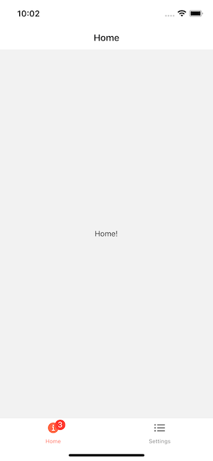
Add badges to icons
Sometimes we want to add badges to some icons. You can use the tabBarBadge option to do it:
- Static
- Dynamic
const RootTabs = createBottomTabNavigator({
  screens: {
    Home: {
      screen: HomeScreen,
      options: {
        tabBarBadge: 3,
      },
    },
    Settings: SettingsScreen,
  },
});
function RootTabs() {
  return (
    <Tab.Navigator>
      <Tab.Screen
        name="Home"
        component={HomeScreen}
        options={{
          tabBarBadge: 3,
        }}
      />
      <Tab.Screen name="Settings" component={SettingsScreen} />
    </Tab.Navigator>
  );
}
From UI perspective this component is ready to use, but you still need to find some way to pass down the badge count properly from somewhere else, like using React Context, Redux, MobX or event emitters.
You can also update the badge from within the screen component by using the setOptions method:
const navigation = useNavigation();

React.useEffect(() => {
  navigation.setOptions({
    tabBarBadge: unreadMessagesCount,
  });
}, [navigation, unreadMessagesCount]);